Show some recent work
- Started
- Last post
- 8,592 Responses
- MrOneHundred0
...and that missing one;

- what's the point size of the tel number and email?typist
- Too small. I’ve moved all contact info to the back.MrOneHundred
- what's the concept behind all these images?typist
- these all look a bit 90s_salisae_
- way 90's ... try to lose the drop shadows at leastrayborn3000
- ismith0


Assignment: To build abstract structures out of skewers, wire, and paper products that are capable of holding 10lbs or more.
First one will hold some heavy textbooks on the folded paper canopy thingy, and the corrugated part underneath will obviously hold a lot more if you slide the top part off. Second one is just a fucked up shoe rack. Dunno, done really early in the semester and was pretty much limited to the supplies I could find in the trash or maintenance drawer.
- theredmasque0
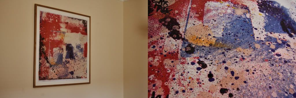
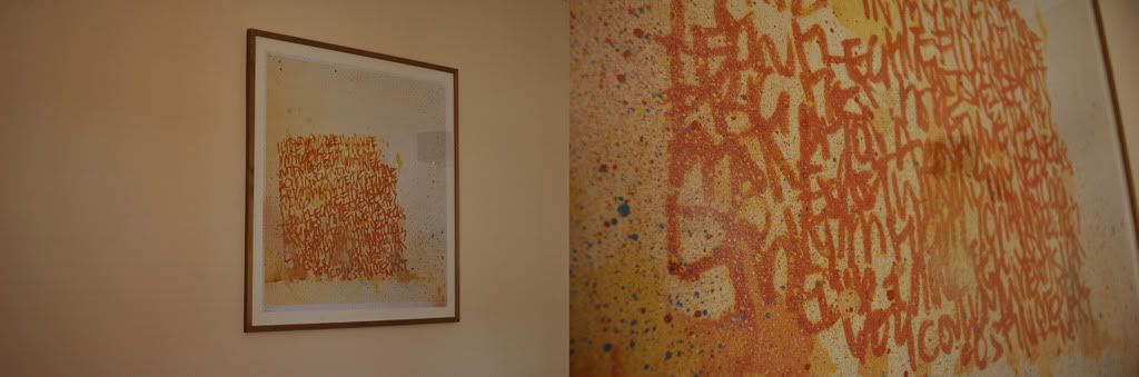
11x14 inches, mixed media / collage on wood panel


- iluvsoul0
- I like these... only if they're not digital stamps.lele
- that second!! woaadigdre
- cheers. Its a mixture of paint, spray paint, hand drawn scrawls and photography. its a limited run of 10 prints of 10 different pieces and they are 1x1m. If your interested drop me a line!iluvsoul
- nice!akrokdesign
- tel, me how much? where? when?digdre
- Hey digdre... just emailed ya!iluvsoul
- JerseyRaindog0
Forgot to add a spam link for the dinosaurs. http://www.etsy.com/shop.php?use…
- sputnik20
really basic design and client was heavily involved, but a good pay day:
- mynameisdave0

--------------------------------...
- Achieve looks a little try hard. Love the font in Chicago, but I can't think of the name of it.Amicus
- thanks, might work a bit more on "achieve." And the font used in "chicago logo" is titillium.mynameisdave
- thanks dave. btw, the gradients on achieve are making it look weakerAmicus
- Thanks. Good eye, It's still in development. I'll get rid of the gradients or maybe work on them more for round 2.mynameisdave
- gradients in logos are very 99 designs thing.akrokdesign
- Good to hear. This will be fixed. :)mynameisdave
- antigirl0


ap of my new print packs.
twelve 5x8.5 inch prints (double sided) - 80lb linen stock - band strap.
- ❤_salisae_
- lovely tif!neue75_bold
- <#antigirl
- i want oneWeLoveNoise
- Lets_not_pretend0
New username, new site (cargo), with new work, sample of which is below:

- real dig the clean, blue underline look of the folio. nice work toobaseline_shift
- cheers! not the best photography, but best I can do with my homemade lightbox!Lets_not_pretend
- really nice mate - wish my school had a program like this. all we had was a ripped up piece of a5 photocopy printoutWeLoveNoise
- hey, you play Qbert , right?typist
- Haha, that logo was 'pre-me', I know exactly what you mean though, and yeah, i used to love Qbert!Lets_not_pretend
- you sure no one handed you a gif and ordered a rip? lolFallowDeer
- Ex-Felt?Dancer
- YupLets_not_pretend
- skt0
I can honestly say, all the bad things that ever happened to me were directly, directly attributed to drugs and alcohol. I mean, I would never urinate at the Alamo at nine o'clock in the morning dressed in a woman's evening dress sober.
- zedvox0
err sorry bout that
- Meeklo0
Flyer for my monthly here in san diego

- neverscared0

- tryin to do 3d stuff.neverscared
- Looks like you're succeeding to me.CyBrainX
- dyspl0
playing with my girfriend business card, while waiting she comes back from work.
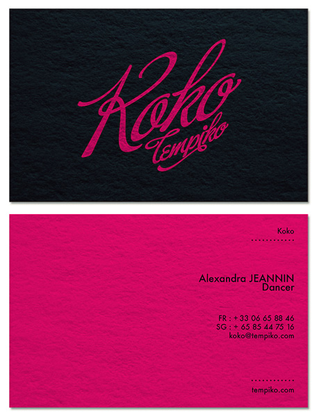
- need more work on it, but it's 4am here...dyspl
- loving the colour and the direction the logo is taking... not sure about the layout of the contact detailsAmicus
- probably the spacing being similar but not quite the same.Amicus
- yes, I was not happy with the detail side. both typo and layout need work.dyspl
- I'd like to give it a cabaret feeling without being too litteral (and as she does much more thn cabaret, I would like to keep the style more open)dyspl
- the overall look open enough.dyspl
- Food Job you are in a different country as my new ID is very similar.. inspired by the "Fame" logoDancer
- "Good" JobDancer
- You gave your gf's phone number the internets?
j/k looks cool.slappy - listen to Dancer, he knows this shit...
And what type of dancer is she? Should we include a pole on the left side to balance things out?OSFA - left to balance things out?
;)OSFA - I think Buffet Script needs a lot of work generally, but particularly the cap Rfoz
- Arild0
The set: http://danielsenphoto.com/single…


