logo critique
- Started
- Last post
- 28 Responses
- drgs

discuss
- Nairn0
I don't see the point unless I can actually see it used in situ.
- brandelec0
needs more pubes
- spendogg0
remove the black nose and you have NSFW
- doesnotexist0
the black type is overbearing and suffocating that poor dog.
- ********0
could you make the logo bigger...
if you gave it a wee rub...
sorry, it's late, and i'm a little drunk.
- Jaline0
what spendogg said.
- Nairn0
wonderful - thanks, skt. Your mentioning alcohol awakened something dark in me.
i'm now drinking absinthe.
- k0na_an0k0
needs more cock
and a cowbell
- ********0
not sure if the object is lit correctly.
- k0na_an0k0
to make the dog more lifelike add a vein to it's nose
- ********0
ahahah.
- sureshot0
looks like a charlie chaplin penis.
- ********0
in a dozen posts, half mention a penis.
- sureshot0
whoa you did it again yourself!
- cilantrobot0
needs more cock
and a cowbell
k0na_an0k
(Sep 4 07, 13:52)----
You win.
- gregpassuntino0
looks like a penis to me, with hairy nuts.
- lvl_130
needs more flames.
ie:
NSFA(nyone) by the way.
- OSFA0
jox???
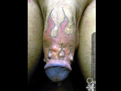
- lvl_130
needs more flames.
ie:
scan.net.au/scan/journ... [jpg]NSFA(nyone) by the way.
lvl_13
(Sep 4 07, 21:41)jox cox???
OSFA
(Sep 4 07, 21:41)
- horton0
needs more feathers:
