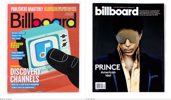
Billboard Redesign
- Started
- Last post
- 29 Responses
- i_monk0
Why was my post deleted? I demand an answer!
- hektor9110
I agree with the logo. But, I really like the editorial sections.
- monNom0
now it looks like every other magazine. success!
- canoe0
Armin Vit - what a boring child.
- newuser0
No one will notice.
- Nathan_Adams0
Come on guys, surely you know there was more to this project then retyping the logotype.
- Sure. There was changing the dot on the i, and picking out a new orange.Continuity
- omg0

- TheBlueOne0
- even the favicon sucksmonospaced
- the website looks better than it did, not that bad...utopian
- No complaints on the site.. i think it's lovely.bogue
- instrmntl0
looks better on the magazine, but worse by itself.
- hans_glib0
very pentagram
- desmo0
Mmm... meaty.
- detritus0
cui bono?
- marindsgn0
meh
- twokids0
this was necessary, why?
- Continuity0
1) Select text object in Illustrator
2) Select bold version of typeface in Character drop-down
3) ?????
4) PROFIT- Don't forget change the 'B' to lowercase. Then send invoice for $250kETM
- Oh yes, too right.
My god, I've got cynical.Continuity
- Amicus0
Has anyone else noticed that the counters now resemble the old 7" singles?
As an evolution this is pretty solid – geddit? – but not groundbreaking. I would have tooled with the 'r' a little to tighten up the kerning.
- bumdrizzle0
the pvn takes a break from the PP presentations they are working on to demonstrate, once again, their unenviable ability to foster intelligent design discourse.


