why
- Started
- Last post
- 14 Responses
- bjladams
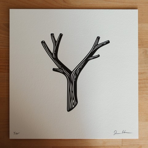
looking for some inspiration on the letter "Y" -
end product will be bronze cast. customer likes sharp serifs.
any criticism or ideas would be appreciated. my main concern in she joint - i think it looks too.... human.

- see_thru0
looks like Hebrew...
- bjladams0
*that should read: "my main concern is the joint" ... but because it looks like a 'she joint' ...
and yeah, it's quite a hebrew looking deal
- Fax_Benson0
maybe try some more contrast in the stroke weights? Looks rather chunky and bovine with everything at the same heavy weight. What's it for?
- indeed. it's for a company that works with historic properties downtown.bjladams
- zoozoo0
bovine... hah
- dasohr0
looks like a chalice.
- GeorgesII0
look for "Y the last man" covers

- drgs0
too square looking
- d_rek0
Looks more like a chalice in silhouette than a Y. I think drgs is right - a little too square. Maybe bring down the stem or put arms at angles
- bjladams0
cheers for the input.
- Miesfan0
I know it will be of bronze, but what size will end?
Be caught with your hands
It will be a medal? It will be a trophy? or just a sign?
What will be done with it?
- bjladams0
the largest one will be around 30" tall, and around 50 lbs.
the relief will be over 2"
they've asked for it to be fairly chunky. linear, and with some curve in the bends - as it'll have external spotlights. it'll be offset with stand-offs.
but, another reason for the bulkiness of it, is that the entire name will be made to match the typeface, and they'll be engraved onto key sets at less than 1.5" wide...
.svg/470px-Japanese_Road_sign_(Y_shaped_intersection).svg.png)