The Save Icon
- Started
- Last post
- 67 Responses
- lvl_130
cloud + ^
- monospaced0
I find that only shitty ass apps (Microsoft) still use the floppy disc. Most use a folder with an arrow, or an HD, as the Save icon.
- doesnotexist0
another discussion here:
http://blog.picol.org/what-the-h…- i've used the one in the upper right beforejaylarson
- that hard disk icon is great, works for SSD tooanimatedgif
- Continuity0
Funny enough, I don't really remember any sort of iconography in early GUIs around these two bad boys:


Funny in that GUI designers only really started with icon use for a Save metaphor with the 3.5 floppy.
- SteveJobs0
i'm not really crazy about arrows pointing to things because they still don't convey anything to someone - especially when there's so many variations of the arrow pointing to a variety of objects and in different directions. arrows and their orientation have a specific message, so this can be confusing.
personally, if i were to come up with a new save icon, i'd create a new symbol that has some esoteric, but valid meaning, and it would be something that people would recognize universally as the meaning for 'saving'. just like the power icon:

- Continuity0
The power icon isn't _that_ esoteric, though, is it? I thought it was generally understood to mean a circuit being broken or closed.
- actual meaning esoteric to the general public. but recogizable symbolically, making it timeless and in my opinion, perfectSteveJobs
- I guess I was probably giving the general public too much credit for assuming what it actually represented.Continuity
- Assuming they knew what it actually represents, I meant.Continuity
- waterhouse0
^
No, it is not.
- doesnotexist0
some don't use a save symbol at all
illustrator
- omg0
Jesus saves...

- stewdio0
Just wait until this thread really gets started—when we start ranting against the entire desktop / file / folder metaphor...
- jaylarson0
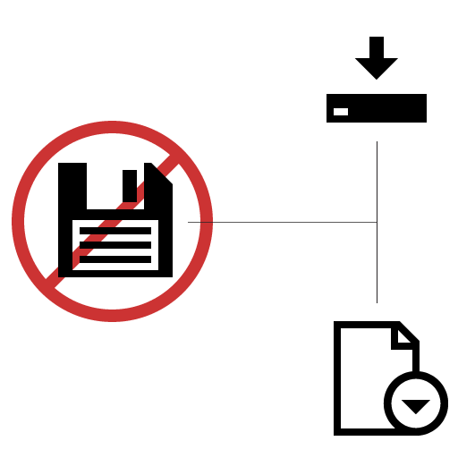
i like the use of an sd card to save on. still sticking with archaic hard disk, at least the image is current:

- Why not just use a Folder with arrow insteadanimatedgif
- which one's the save icon?
rascuache - Sjaylarson
- SteveJobs0
before the floppy disk, they just used the word 'save'. perhaps the better choice.

- even from the grave... wisdomPonyBoy
- LOL @ Holding reset, wtfanimatedgif
- haha i love that you mentioned thatjon_d
- animatedgif0
"Why are we having such a hard time deviating from this legacy symbol?"
Microsoft and those stuck in their ecosystem seem to be the only people having trouble escaping it
Windows Phone 7

- this is really WP7? Someone thought this looked good enough to release?supersimple
- that's horribleSteveJobs
- You should take a look at BlackBerry's interfaces.MondoMorphic
- Think this is an early shot to be fair, but that save icon should never have been drawnanimatedgif
- That is final UI. I really like the UI, but it's those little details that Apple always catches.
http://www.gilsmetho….ETM


