new waterstones identity
- Started
- Last post
- 25 Responses
- hans_glib

via craytive reevue
- Jimbo820
Who did it?
- Continuity0
It's not much of a departure from the old identity, is it ... ?
- Aye it is. Beforehand they had an elegant type mark, now they're a hoover brand or something.detritus
- Ah, righto. I'll agree, this new thing isn't doing it for me at all.Continuity
- Jimbo820
Why does it need to have .com on the end?
- detritus0
Oh my - why?
- set0
I like it, although agree it doesn't need the .com
- WeLoveNoise0
christ - someone just fuckd up that brand
- bored2death0
What is Waterstones?
- bookstore... UK.... google has search, btw.set
- Fuck yourself, bye the way.bored2death
- also, the new logo has their web address!jamble
- what a complete cunt!set
- Jimbo820
Everyone knows Waterstones as the High Street bookshop, if they think they are going to take on Amazon... pppfffftttt good luck.
- calculator0
It has .com because that's eventually the only place they'll exist. Just planting the seed.
- Interesting.Jimbo82
- Eventually thats the only place anything will exist... *que xfiles music*set
- good pointWeLoveNoise
- detritus0
I get the .com add, I don't get the generic, modern (a few years ago) makeover. Books is books. They have serifs.
Get over it, bricks and mortar - you're not an iPad. You don't need to be. Most of your consumers probably hate technology anyway.
Gun, foot - shoot.
- BOOKS DON'T HAVE SERIFS
PEOPLE DO.
No, sorry
LETTERS DO.detritus - National Serif Association? :DContinuity
- :)detritus
- BOOKS DON'T HAVE SERIFS
- Ruffian0
Smells like shit. Looks like it too.
- BaskerviIle0
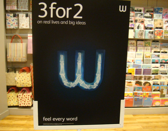
OMG, they lost the Baskerville!
You can see why I might be personally insulted by this move.I always liked seeing a nice typeface on the highstreet amongst all the crap, now they've just joined the rest, with no reference to what they sell...books, literature etc.
and what's this all about:

- WeLoveNoise0
anyone know the studio designed this ?
- detritus0
"According to a Design Week story posted on mad.co.uk, here, HMV (Waterstone's parent company) has apparently driven the rebrand and worked with its preferred branding agency, venturethree."
- http://www.ventureth…detritus
- Shame, I like the work they've done for Sky and The Times.detritus
- Evil Capitalist Murdoch bottom-feeding scum that they clearly are :)detritus
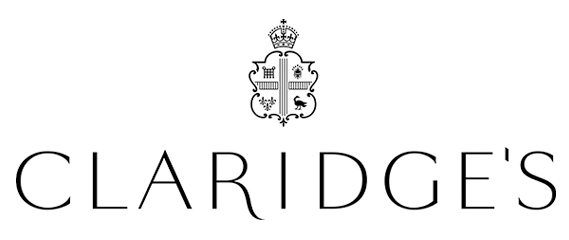
- BaskerviIle0
As a contrast, also from CR, look at the lovely work for Claridges rebrand, tradition and contemporary done well:
http://www.creativereview.co.uk/…
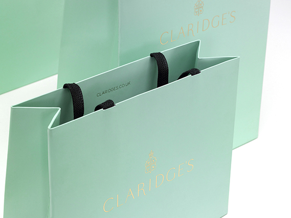

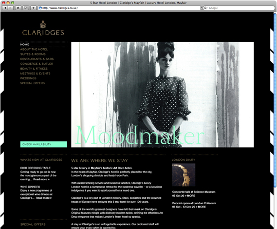

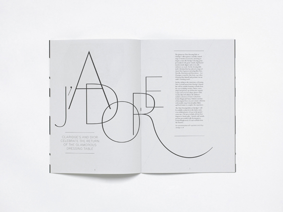
- Lovely stuff, very classy. Website looks like shit though.jamble
- A little too close to Tiffany's blue, no? Looks good on black, though.formed
- Oh, this is very elegant.Continuity
- dibec0
it's not bad. it has a real hard contrast feel compared to original w. totally makes sense. feels modern and clean.
- lukus_W0
While a serif does necessarily = posh, the new re-brand does cheapen the brand. Seems far more generic - a mistake, imo.
- pillhead0
I'm going to go out on a lim here and say I like it, the play on the W works well.
- hans_glib0
i think the mistake was to keep the large new W. it looks very odd by itself, but it works ok as part of the wordmark. they were obviously too frit to lose the W... in which case maybe they should have stuck with the original?? and quite apart from the .com nonsense, losing the apostrophe doesn't help the generic feeling of the new mark