glitter doesn't hurt
- Started
- Last post
- 44 Responses
- mrghost
only if it gets in your eye..
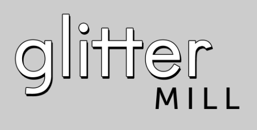
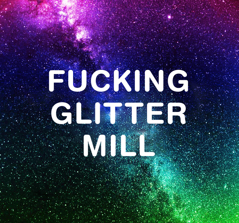
what you think of this logo? I made it, for me.
- quack0
not a logo
- monospaced0
I don't get why there's a huge gap between a pair of t's that you intentionally placed there. Why is the word mill sticking out the side? Why have an outline and a drop shadow? I agree with quack, it's not really a logo, and if it were, it's kinda crap. k good. ;)
- gap between tt = cleavagequack
- true truemonospaced
- hahahahProjectile
- CygnusZero40
Glitter doesnt hurt, but the lack of creativity in the logo hurts me.
- d_rek0
gliHer mill
- bigtrickagain0
it smacks of haste.
- jmilligan0
intrigued by how you can post on qbn from your mac plus
- these are screenshots uploaded to a tumblrmrghost
- lolbigtrickagain
- what do you mean?mrghost
- http://headgap.com/~…iCanHasQBN
- i see.. thats funny.mrghost
- airey0
i prefer to be economical with reviews so "fucking shite" would be the best way to explain the 'logo'. of course that's just one hack's opinion.
- garlic0
likewise
replace the first 'g' with 'sh' and it will do the job fine
- mrghost0
- ):bigtrickagain
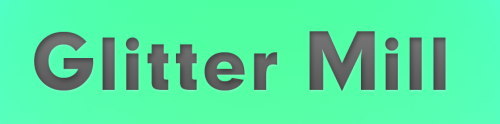
- the colour. my god.Projectile
- Is there a gradient in there? :(villars
- aaaargh!!! my screen just diedProjectile
- instrmntl0
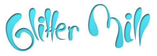
just use JackRyan's and call it a day
- mrghost0
- (ok this time its a joke)mrghost
- this time?? wait, you mean..
oh jesus!Projectile - best one so farcalculator
- airey0
i prefer this one than the original. if you get the client to sign-off on this i'm sending you an itunes voucher for sheer balls.
- bigtrickagain0
you're just doing layer styles on text ):
- JackRyan0
- hahaha. the gold medal goes to...airey
- alright.mrghost
- HAHAHAHAHAduckofrubber
- mrghost0
okay! ill try again tomorrow guys. thanks for stopping by!!!