QBN Design Challenge 1 (QDC)
QBN Design Challenge 1 (QDC)
- Started
- Last post
- 49 Responses
- neverblink0
quick revised type..
- yea type is better even though circles feel kinda hugheattentionspan
- feels huge*attentionspan
- I like it.Knuckleberry
- Me likee.......
move
- Meeklo0
up
- ylanse0
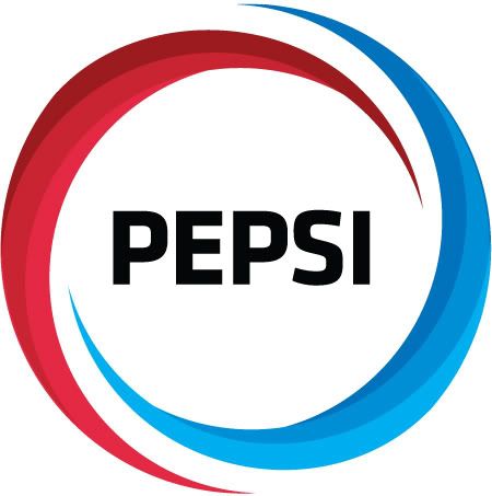
On a related note, alsoread this design brief explaining the new Pepsi logo as a design inspired by the Mona Lisa and Earth's magnetic fields, supposedly made by the creative agency that produced the logo as part of a £750,000 revamp
http://drop.io/pepsipdf/asset/pe…

- neverblink0
any more?
- Yeah I thought there would be loads more posts for this !?!?!jysta
- not at success I see..Meeklo
- don't give up.. I enjoyed the exerciseneverblink
- faintheart0
- you know... I'm not convinced on this one as it is now, but I think you have something there...Meeklo
- It looks like a bubble filled with a liquid..Meeklo
- i did it in 20 min.faintheart
- is that a good thing?Meeklo
- Samush0
liking the idea of QDCs, shame im too lazy and shit to take part.
- eryx0
Here are my Contributions


I tried to keep it simple and familiar. Tried to create more white space.
- monkeyshine0

- you should upload a larger version, I like the 4th oneeryx
- version30
again, thinking through what exists, pepsi could release this image wrapped around a can in limited release & it would fly off the shelves (even i would buy 1, but not to drink)

- the2ndday0
you guys are kidding me, right?


