Vista Sans Light
- Started
- Last post
- 12 Responses
- ********
Hey there,
What do you guys think of that font?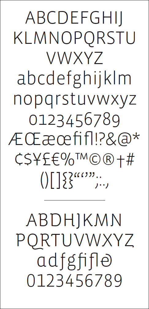
- ********0
has it something to do with Windows Vista? Just asking...
- not at all! thank God...********
- The font could work, I would like to see once you start the logo.********
- not at all! thank God...
- ********0
I LIKE®
- I want to use it for a video production company.********
- I want to use it for a video production company.
- moamoa0
I don´t think its a good font.. but better then the other 90% on pcs
- ********0
lowercase letters similar to DIN, nice
- moamoa0
and I am thinking about buying Andrade from dstype.. anyone has some experience?
http://www.dstype.com/andradepro…

- ********0
^ Some really nice fonts here:
http://www.typography.com/fonts/…- I bought already mercury & chronicle, I need a fashoin in the font :)moamoa
- TheBlueOne0
Doesn't Good magazine use that?
- monkeyshine0
I don't like the R...it's top heavy like Dolly Parton.
- There isn't one R in any typeface, ever, that Im truly happy with. Love to be proved wrong :/mikotondria3
- jonaschafer0
it's cool. altho i hate drop numbers or whatever its called.
- monkeyshine0
I'm fond of the Fedra R. It's graceful.
- 5timuli0
Vista Sans is great. The Alt version has some nice understated swash characters.
- psv780
That font already exists and is part of a very well known type family from Emigre.