Show some recent work
Show some recent work
Out of context: Reply #7426
- Started
- Last post
- 8,591 Responses
- Miguex16
Album art for G Jones & Eprom - Acid Disk EP
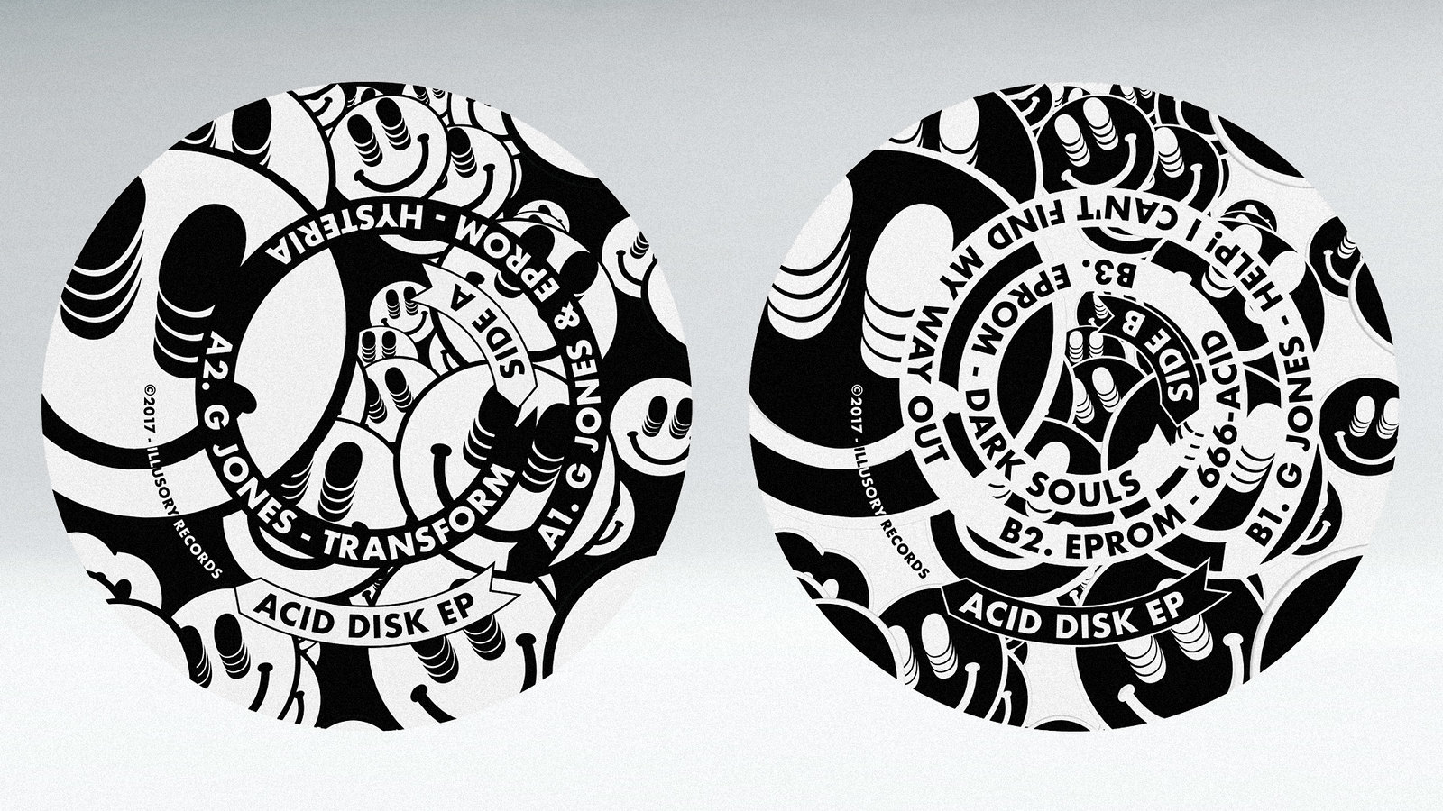
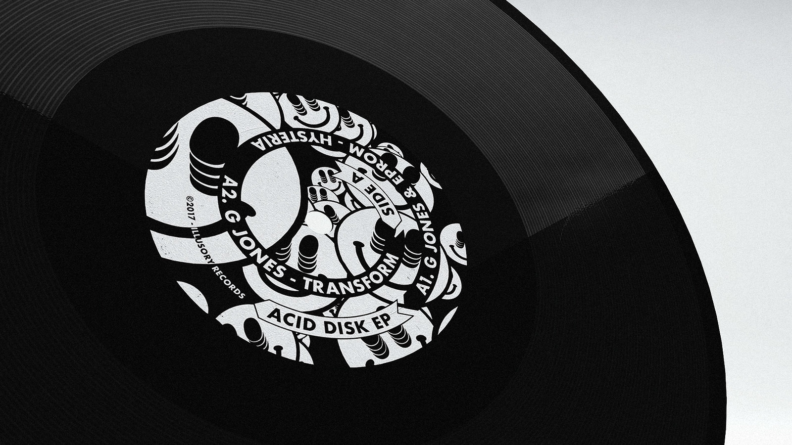


The concentric type on the labels is meant to be read while the record spins on the turntable, at least on the video below, if you stare at the center for a bit and then you look away, you will get some visual distortion which works with the whole "Acid" theme of the project :)
- There's a digital version on spotify if you want to listen:
https://open.spotify…Miguex - I WANNA SEE IT IN YELLOW
:)
Lovely stuff.detritus - haha why yellow?Miguex
- nice!
(yellow would be wrong)Gnash - You can't use the smiley face and
ask 'why yellow?'!detritus - ^ exactly the reason you can't use yellowGnash
- Not saying it would be betterin yellow, just that i want to see it in yellow.
And no, yellow is Aciiiiiieeeeeed 4 evadetritus - Eprom?!??!?! Fucking WOW!!! Respect!!!oey
- Looks familiar ;)set
- yellow because this: https://a3-images.my…HijoDMaite
- Literally two posts backset
- and this: https://thumbnailer.…HijoDMaite
- very cool Muguex!!HijoDMaite
- approvedprophetone
- just bought 'transform'prophetone
- ...and 'hysteria'prophetone
- I was thinking the same, set :)Gnash
- Set, I have to be a man and admit, I saw your post and designed this in only 5 days, thanks for the inspiration :)Miguex
- ^ :)Gnash
- :)monospaced
- it's v.nicefadein11
- Coolyuekit
- love this:
https://www.instagra…fadein11 - much likeimbecile
- DOPEsiesRamanisky2
- Asssssid!futurefood
- There's a digital version on spotify if you want to listen: